Innovations Fitness: How we rebranded this Boot Camp fitness company and gave it its wings!
- Andy Whiting

- Jun 21, 2022
- 4 min read

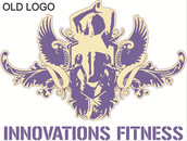
“Hello mate, I’m Topsy from Innovations Fitness, I hear you’re the guy to chat to about marketing locally!” was how the phone call started. It was the week before Christmas 2021 and as most companies were winding down for the festive break, Topsy (AKA George Turner, the Founder and Lead Instructor of the business) had an eye on the coming New Year and the important, annual ‘New Year, New You, New Start’ fitness period of January. “I’ve got great classes. A great team and very loyal client base, BUT I want to freshen things up for 2022 and get my business out there!” was the essence of the marketing brief. With just days to go before the January window of opportunity for his business, it was full steam ahead to review and audit his existing branding, website, social media and client communications. Fast! One very chilly morning in January, I attended my first Boot Camp session to see first-hand a class in action and take a bank of new photography and footage for his social media channels. I was slightly in awe of the dedicated individuals who’d got out of bed on a freezing January morning … to exercise in the park! I came away feeling really inspired by Topsy and his method of motivating and supporting his Boot Camp’ers at the session and could clearly see how he’d built a legion of happy Boot Camp clients. We quickly rolled out the new photography and a temporary set of newly branded social media content panels and banners. But I felt the existing logo, whilst a lovely illustrative piece of art, was far too intricate for his business. It was hard to read properly and was not representative of the modern and vibrant business I saw THAT morning in the park. Thankfully Topsy was more than happy to take my advice and guidance, so we embarked not only on a new website build but a complete rebrand, which would impact every corner of his business from his social media channels to the shirts and apparel the team wear. I devised the rebrand creative brief and quickly knew that there was one person I needed on the project, my long-time collaborator, Graphic Designer, and all-round design genius Ali, of Ali Schillemore Graphic Design. Over to Ali tell you about the next part …
“It's always great to collaborate with Andy on projects because he provides me with such thorough creative briefs from his brand audit and brand identity work with each client. And this brief was no different!
He told me the client wanted to refresh and modernise the brand, but Andy was keen to keep some connection/reference to the old logo design, which they had built their success with. I reworked the wings opening out from the shield, they added an organic element to work with the strong geometric shapes within the icon.
The finished logo acknowledges the military history of its founder, the companies sporting/fitness credentials, as well as where the company has come from, but it brings it up to date, it is flexible and adaptable, making it future proof for many successful years to come.
The logo is adaptable and can appear in various colour variants of blue, orange and white and the wings and shield can appear together or as independent icons.”


Thanks Ali for that! Now, what about brand colour choice?
The existing colour palette (seen above in pic1) of the branding was predominantly navy blue and a beige/fawn colour which felt quite flat and bland. So, I asked Ali if we could inject a pop of bright orange to compliment the deep blue. This would feel more energetic, vibrant, sporty, and more importantly it would stand out better as a fitness brand. If you want to check-out my thoughts on colour psychology within business branding, my previous blog has some thoughts on this, read it HERE.
Fast forward a few months, lots of visits back to Boot Camp in Emsworth Park (without actually putting my trainers on or lifting a kettle bell 🤣) and here we are with our new branding, new website and some rather lovely new branded sportswear too!


It takes a lot of conviction to entrust your entire business and branding to someone and Topsy has become a great friend through the process. His is commitment to follow my lead and guidance has made the project such a joy to work on and I am really pleased and proud of the end result.
Getting your branding (or rebranding) right is a process of laying the solid foundations and structure of your business. Once these are in place everything else sits more organically around your messaging, customer communications and marketing. A rebrand also re-energises a business across both the staff within it and its customer base, as long as it it done appropriately.
I hope you all like where we have landed with this one!
If you’re in the Emsworth area, Boot Camp classes take place Monday-Saturday and you can find out more and enjoy his shiny new website that I built for him here … www.innovationsfitness.co.uk
If you’re looking to refresh your brand (or build it from scratch) or maybe you just need some general marketing advice and support, please do drop me a line for a chat.
Thanks for reading.
Andy
email: info@andywhiting.com


Comments